- The “H” Isn’t What You Think
- History: How the Logo Evolved
- More Than a Letter: What the Emblem Proclaims
- Subtle Design Tricks and New Era Touches
- How Hyundai Sets Itself Apart
- Key Highlights
- “The Handshake in the Metal”
Think you know the story behind Hyundai’s badge? Many mistake its slanted “H” for a generic symbol or another take on Honda’s familiar emblem. But the truth is layered, deeply intentional, and reveals much about the brand’s global vision, values, and relationship with its customers. In this fully reimagined (700+ word) feature, uncover the origins, design secrets, and psychological power behind the logo—plus a fable to show why sometimes, a simple handshake can change everything.
The “H” Isn’t What You Think
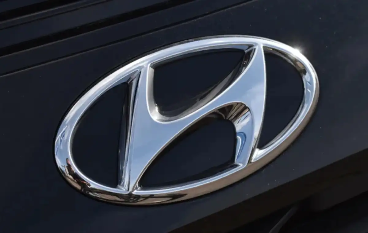
At first glance, the Hyundai logo is simply a stylized “H” in an oval—apparently just the company’s initial.
In reality, that “H” is two people: a Hyundai representative and a happy customer, locked in a handshake. The right “leg” (customer) leans toward the left (Hyundai), both figures leaning into the bond of trust.
The enclosing oval symbolizes Hyundai’s global ambitions and its promise of unity with customers across every continent.
History: How the Logo Evolved

Hyundai’s first automotive logo (1970s–80s) was a basic wordmark or a simple “HD”—functional but lacking emotion or deeper meaning.
In 1992, the slanted “H” and oval were adopted, a deliberate shift toward a modern, unified, and international visual identity. The forward tilt represents dynamism, innovation, and never standing still.
Major updates over the years—moving from blue to chrome and now to minimal 2D black—have made the logo digital-friendly, timeless, and ready for an era of electrification.
The handshake symbolism has endured through every visual refresh, always reflecting partnership, transparency, and mutual satisfaction.
More Than a Letter: What the Emblem Proclaims
The “H” handshake connotes trust, satisfaction, and customer-centric service—a human touch often lost in the automotive brand race.
The oval brings together unity, inclusiveness, and Hyundai’s evolution into a global powerhouse, no longer just South Korea’s value automaker.
The tilted, italic stance suggests progress and “forward momentum,” visually reinforcing the Korean name’s meaning—Hyundai translates to “modern” or “contemporary”.
Subtle Design Tricks and New Era Touches
The logo’s silver or chrome finish evokes a sense of technology, advanced engineering, and reliability—perfect for Hyundai’s pivot to high-tech, electrified vehicles.
On some new EVs (like Ioniq 5), the “H” badge is replaced with four Morse code dots—another playful nod to Hyundai’s initial and the brand’s embrace of smart, digital thinking.
Modern digital renderings of the badge further simplify it, ensuring easy recognition on screens and apps worldwide.
How Hyundai Sets Itself Apart
Key Highlights
The Hyundai logo cleverly fuses human connection, progress, and technological ambition in one simple symbol.
The handshake forms the heart of Hyundai’s brand DNA: partnership and reliability with every driver.
The oval shape underscores unity and the company’s global expansion beyond Korea.
Colour and minimalism reflect innovation, sustainability, and a digital-first mindset.
New touches—like Morse code or glowing badges—show that Hyundai is playful and future-focused.
“The Handshake in the Metal”
Two drivers, eyeing new cars, debate brand loyalty at a dealership. One pauses—“What does that ‘H’ mean?” he wonders. The sales rep smiles and reveals the handshake hidden in plain sight. The moment, full of trust and symbolism, turns an ordinary purchase into the start of a true partnership—just as Hyundai’s founders intended.