
- Why does the logo’s meaning matter?
- Name and logo origins: from aircraft engines to cars
- What do the blue and white colors in the BMW logo mean?
- The spinning‑propeller myth: where did it come from?
- How the logo evolved through the decades
- How the logo shapes BMW’s image in enthusiasts’ minds
- Why BMW still cares about its logo in the electric era
- What the BMW logo stands for
- S
The BMW logo is one of the most debated and interpreted car badges in the industry; some people see it as a spinning airplane propeller in the sky, while others connect it directly to the blue and white colors of the German state of Bavaria, where the brand was born. Understanding what the logo really stands for means understanding more than 100 years of industrial and brand history, from aircraft engines to luxury and electric cars.
Why does the logo’s meaning matter?
The BMW logo is not just a neat circle on a bonnet; it is a visual shorthand for a German industrial story that started with aircraft engines and today represents premium, tech‑heavy road cars. Knowing the logo’s roots helps explain how a company moved from the sky to the road, and from two world wars to the era of luxury and electric mobility.
This article looks at the origin of the logo, how it has evolved over time, what the colors and shapes represent, how the famous “propeller story” emerged, and how all of that connects to the way people see the brand today.
Name and logo origins: from aircraft engines to cars

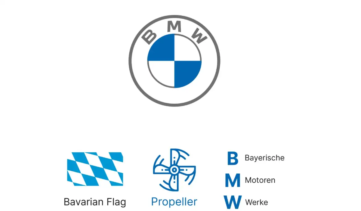
The name BMW is an abbreviation of “Bayerische Motoren Werke,” which translates to “Bavarian Motor Works” in English.
The company was born in Bavaria, in southern Germany, which explains why the logo takes visual cues directly from the state’s flag and colors.
In the early 20th century the company was more closely tied to aircraft engines and motorcycles than to passenger cars, long before BMW became associated with sporty sedans and premium SUVs.
This historical background is the key to understanding the confusion between the “airplane propeller in the sky” story and the actual design intent linked to Bavarian identity.
What do the blue and white colors in the BMW logo mean?
Blue and white are the official colors of the Bavarian flag, representing the company’s home region and industrial roots.
The color blocks inside the circle reflect the idea that this is a proudly “Bavarian product,” not just a global brand without a geographic identity.
The black outer ring was a common element in many German industrial logos of that era, acting as a formal frame around the brand identity.
So at its core, the logo is about “Bavaria + engines” more than “propeller + sky,” even though both interpretations have become linked to the brand in the public imagination.
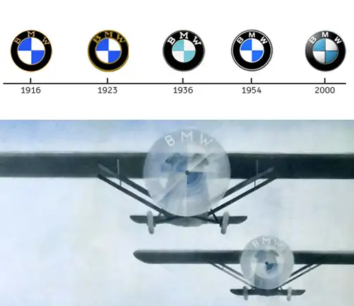
The spinning‑propeller myth: where did it come from?
For many years, people believed the BMW logo literally depicted a white airplane propeller cutting through a blue sky. That idea became popular for several reasons:
The company’s historic association with aircraft engines in its early decades.
Old advertising material that showed an airplane with the BMW roundel superimposed on the spinning propeller, visually reinforcing that reading.
The simplicity and memorability of the image, which made it easy to repeat and transmit until it turned into a “popular truth,” even though it was not the original design intention.
Today the company itself acknowledges that the “propeller myth” helped cement the brand’s association with technology, motion, and dynamic performance, even though the logo’s roots lie first and foremost in Bavarian colors.
How the logo evolved through the decades
You can trace BMW’s history by following how its logo has changed:
Early years: A thick black circle with “BMW” at the top and simple blue‑and‑white quadrants inside, with a very straightforward graphic style.
Post‑war period: Minor refinements, but the overall circular structure and color layout remained intact.
Late 20th century: The logo gained three‑dimensional effects, shine, and chrome‑like edges to match the fashion for metallic badges on cars.
Recent years: A move toward a flatter, more minimal design, with reduced gloss and 3D effects to fit better on digital screens, user interfaces, and illuminated elements.
This evolution mirrors the brand’s own shift from a pure “engine manufacturer” to a broader “mobility provider” in a digital era, while keeping the key visual DNA intact.
How the logo shapes BMW’s image in enthusiasts’ minds
The black ring and the three letters “BMW” have become synonymous with the idea of the “Ultimate Driving Machine” and pure driver enjoyment.
The blue and white colors communicate a sense of cool precision, German/Bavarian engineering, and a certain understated confidence.
The logo’s relative simplicity made it timeless and highly adaptable; small tweaks over time were enough, unlike more complex logos that required total redesign.
For many enthusiasts, seeing the badge on the steering wheel or bonnet is instantly associated with a specific driving experience: a balance of sportiness and comfort, technology and heritage.
Why BMW still cares about its logo in the electric era
As BMW pushes deeper into electric and electrified cars (such as the i‑series and latest EV platforms), it became necessary to adjust the logo visually so it appears:
Lighter and less “mechanical,” more in tune with clean, digital, and sustainable mobility.
Perfectly readable and scalable on screens, apps, and infotainment interfaces, not only on metal panels.
Consistent with an interior design language based on curved displays, ambient lighting, and smart technologies.
Despite these updates, the circle, the colors, and the BMW name remain at the center of the identity, ensuring that customers don’t lose their emotional connection to the brand’s history.
What the BMW logo stands for

The name BMW stands for “Bavarian Motor Works,” and the logo is rooted in the colors of the Bavarian flag.
The popular myth says the logo shows an airplane propeller against a blue sky, a later interpretation reinforced by historic advertising.
The black outer ring adds a formal, traditional feel that ties the emblem to its German industrial origins.
The logo has evolved from a metallic, three‑dimensional design to a flatter, more digital‑friendly version without losing its core elements.
Today the emblem represents a mix of Bavarian heritage, German engineering, and the joy of driving in a world moving toward electric and connected mobility.
Ultimately, the BMW logo reveals three essential layers of identity. First, there is a clear regional root in the Bavarian colors, reminding us that BMW began as a local engine manufacturer before it became a global brand. Second, there is a strong technical legacy tied to aviation and high‑reliability powertrains, which helped the “propeller myth” take hold and turned it into part of the brand’s collective memory. Third, there is a proven ability to adapt visually to the digital age, shifting from a heavy metal badge to a flat, screen‑friendly mark without sacrificing recognisability.
This combination has made the BMW logo a compact symbol of precise German engineering, sporty driving character, and deep historical roots. At the same time, it sits comfortably on electric crossovers, luxury sedans, and digital dashboards, as the company transitions from “engine maker” to “smart mobility provider,” while the blue‑and‑white circle remains a constant on the bonnet and the steering wheel.
