- The Beginning: How Was the BMW Logo Born?
- Is the BMW Logo Really a Spinning Propeller?
- The Evolution of the BMW Logo Over Time
- A Logo That Reflects BMW’s Evolving Spirit
In the world of luxury automobiles, BMWUAE BMWEgypt BMWBahrain BMWKSA BMWKuwait BMWOman BMWQatar BMW shines as a German marque that blends thrilling performance, eye catching elegance, and precise engineering. Yet behind the brand’s stunning vehicle designs stands a circular emblem steeped in history and layered with meaning. This emblem has long fascinated car enthusiasts and sparked curiosity about its true origin and symbolism.
From its colors inspired by the Bavarian flag to the many transformations it has undergone over the decades, the BMW logo reflects a core part of the brand’s identity. The following lines trace the journey of this emblem, uncovering how it evolved and what deeper meanings it has carried from its early beginnings to the present day.
The Beginning: How Was the BMW Logo Born?

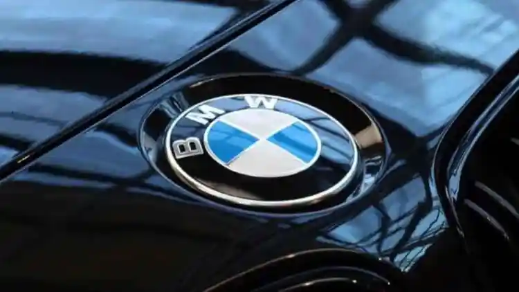
The origins of the BMW logo date back to 1917, when Rapp Motorenwerke, a company known for producing aircraft engines, was transformed into a new entity called Bayerische Motoren Werke, now famously known as BMW. The company’s first logo featured a circular design with a cross pattern in blue and white at the center, representing the colors of the Bavarian state flag, where the company was founded. Surrounding the circle was a black ring that carried the company name written in white letters.
This design was far from random. From the very start, it was crafted to highlight BMW’s identity as a brand deeply rooted in German engineering excellence and its strong Bavarian heritage. Although the company did not begin by producing cars, the emblem remained a constant companion throughout its journey, evolving from building aircraft engines to becoming a major player in the world of luxury automobiles.
Is the BMW Logo Really a Spinning Propeller?

For years, a widely believed myth has claimed that the BMW logo represents a spinning airplane propeller set against a blue sky, a reference to the company’s early history as an aircraft engine manufacturer. However, this interpretation does not reflect the true origin of the design. According to official statements from BMW, the logo’s colors are actually derived from the Bavarian state flag, and the geometric composition symbolizes the precision and balance associated with German engineering.
Despite this clarification, the popular belief continues to thrive, largely fueled by a 1929 advertisement that featured the logo embedded within a spinning aircraft propeller. That image strongly reinforced the mistaken impression in the public’s mind. And although BMW has made efforts to set the record straight, many still link the logo to the brand’s aviation roots, adding a legendary aura to the emblem that goes beyond its actual meaning.
The Evolution of the BMW Logo Over Time

Since its debut, the BMW logo has gone through several transformations that reflect the brand's evolving visual identity. In 1933, the company introduced its first major redesign, enlarging the letters and deepening the shades of blue and white. This gave the logo a bolder and more striking visual presence.
In 1953, BMW adopted white lettering within the black outer ring for the first time. This version also featured a brighter background, enhancing the vibrancy and appeal of the logo. A decade later, in 1963, the brand refined the color tones once again to align with the modern automotive design language of that era.
Then, in 1997, BMW unveiled a significant update with a metallic finish that emphasized sophistication and reinforced the company’s modern character. As BMW moved toward an electric future, it introduced a completely new version of the logo in 2020, first revealed on the i4 Concept model. This iteration replaced the traditional black ring with a transparent one, symbolizing the brand’s commitment to innovation, clarity, and openness to the future.
A Logo That Reflects BMW’s Evolving Spirit

Over the course of a hundred years of change and innovation, the BMW logo has remained deeply rooted in its Bavarian heritage while adapting to modern design trends. Each update to the emblem was far more than just a visual tweak; it delivered a clear message about the brand’s ongoing commitment to reinvention and forward thinking innovation.
Today, the BMW logo stands as one of the most iconic symbols of performance, luxury, and refined German engineering. Within its design lies a legacy of craftsmanship and tradition, all while representing the brand’s continuous pursuit of progress. It strikes a delicate balance between honoring the past and embracing the future.


